Knobs
Knobs are live controls your app declares from its own code. Screenplay renders them in the frame’s Knobs popover and the player’s knobs panel. Changing a value on the canvas updates the running app instantly, for everyone viewing it, with no rebuild.
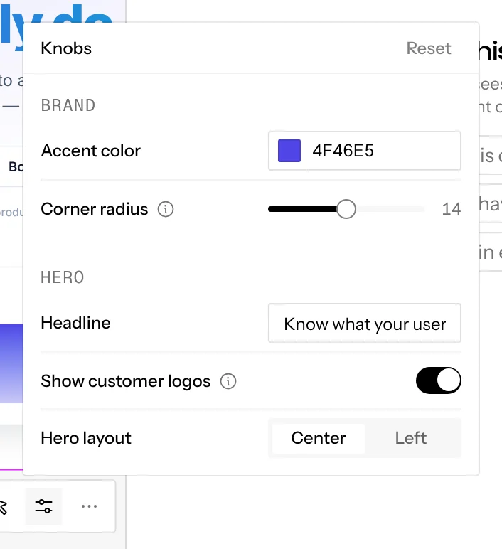
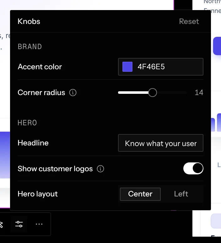
Use knobs for things you want to try rather than decide in code: accent colors, spacing, copy variants, feature toggles, layout options.
You don’t have to write knobs yourself. Ask the agent (“add a slider knob to
control the card padding”): Screenplay ships a screenplay-add-knob
skill that teaches it how.
Install
npm install @screenplay.space/knobsReact 17 or later is a peer dependency.
Declare knobs
useKnob returns the knob’s current value:
import { useKnob } from "@screenplay.space/knobs"

export function App() {
  const accent = useKnob({
    id: "accent",
    type: "color",
    label: "Accent color",
    group: "Brand",
    default: "#4f46e5",
  })
  const radius = useKnob({
    id: "radius",
    type: "slider",
    label: "Corner radius",
    description: "Buttons, cards and inputs",
    group: "Brand",
    min: 0,
    max: 28,
    step: 1,
    default: 14,
  })

  return <div style={{ "--accent": accent, "--radius": `${radius}px` }}>…</div>
}
This is the code behind the screenshot above. It comes from the demo app used throughout these docs.
Knob types
Use tabs for two or three short options you’ll flip between, like light
and dark or grid and list. Tabs fill the control column, so keep each option to
one short word (about 15 characters across them all). A tabs knob with more
than three options shows as a dropdown, and anything longer belongs in a
select.
Every knob takes an optional label (defaults to the id). It can also take
a validator: (value) => value, which runs inside your app on every incoming
value so you can clamp or sanitize it.
Descriptions and groups
Each knob is one row: its label on the left, its control in a column on the right. Two optional fields shape the panel further:
description: a short phrase on what the knob affects. The label gets an info icon, and hovering, focusing or clicking it shows the description.group: knobs with the samegroupsit under one heading, in the order the group’s first knob was declared. Knobs without a group come first.
const radius = useKnob({
  id: "radius",
  type: "slider",
  label: "Corner radius",
  description: "Buttons, cards and inputs",
  group: "Brand",
  min: 0,
  max: 28,
  default: 14,
})
How values behave
- Stable
ids keep their values across reloads. Renaming anidresets it to its default. - Values are stored per frame, so two frames of the same page can show different variants side by side.
- Values sync to everyone on the canvas, and carry over when you open the frame in play mode. Changes made in the player stay in the player.
- Reset in the popover’s header clears them.
Without React
import { registerKnob } from "@screenplay.space/knobs"

const unsubscribe = registerKnob(
  { id: "background", type: "color", default: "#ffffff" },
  (value) => {
    document.body.style.background = String(value)
  }
)
getKnobValue("background") reads a knob’s current value at any time, or
undefined for a knob nothing has declared yet.
Knobs on a mockup
A mockup is a static page with no bundler, so it doesn’t
install the package. Its page already has a global
screenplay.registerKnob(def, onChange), which works like registerKnob
above, and every value is also set on the page’s root as the CSS variable
--knob-<id>:
<style>
  .card {
    padding: calc(var(--knob-card-padding, 16) * 1px);
  }
</style>
<script>
  screenplay.registerKnob({
    id: "card-padding",
    type: "slider",
    label: "Padding",
    min: 0,
    max: 64,
    step: 2,
    default: 16,
  })
</script>
You won’t usually write this yourself: ask the chat that drew the mockup for a knob, and it rewrites the page with one. The Knobs button under the selected mockup shows them.
Safe to ship
Knobs only activate in development builds, and only when your app is
running inside a Screenplay frame. Everywhere else, including production
builds, standalone dev, and iframes on other sites, useKnob just returns
its default, and the code does nothing in production. You can commit knob
code without guarding it.
This works with any bundler that inlines process.env.NODE_ENV, including
Vite, Next.js, webpack, and esbuild, with no extra setup. (Before knobs 0.1.4
and state 0.1.3, Vite apps needed a process shim in index.html; upgrade and
you can delete it.)